Four Composition Types
In this task I was required to photograph four different composition styles. These types were to try and capture photographs that aligned on the rule of thirds, balanced each other, created triangles and created 3 layers that overlapped each other. To do so we took some photographs in class, then we were tasked with a homework to photograph more in these same styles. I didn't take a lot of photographs in class due to time restrictions, therefore I felt it would be easier if I integrated them together. However, I think you'll be able to tell the difference as I felt my homework photographs are much better. Throughout, this task I felt that I really am starting to learn how composition can really affect your image. I loved taking the photographs from different perspectives. I felt that finding a good image and then innovating the image through the lens to fit the brief worked the best, as it made for the best photographs.
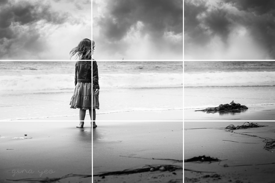
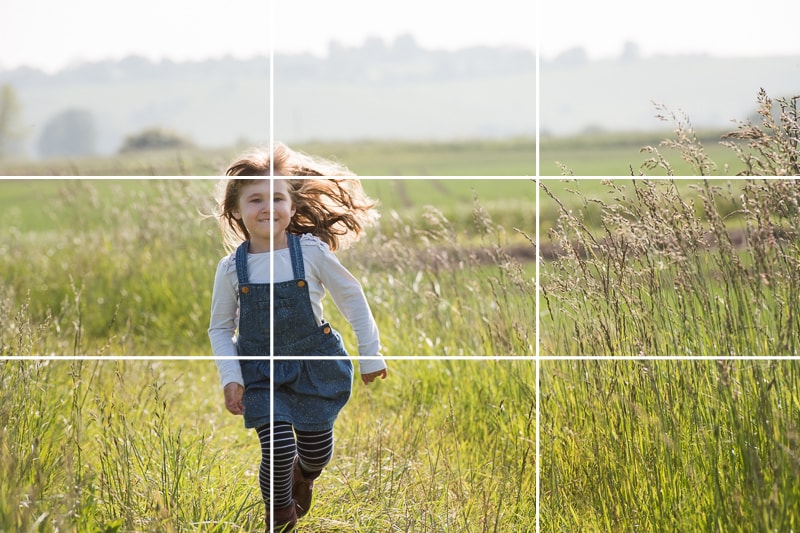
Rule of Thirds
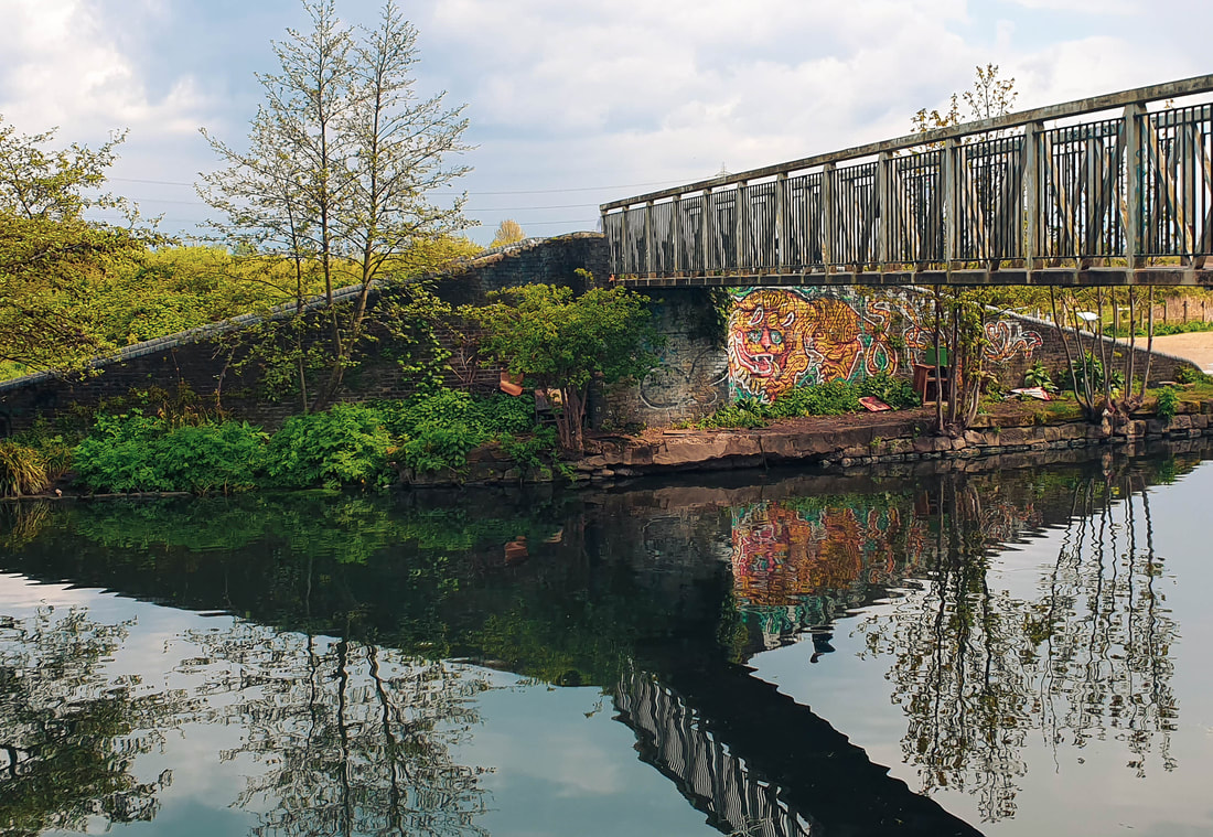
Rule of Thirds is a photographic term used to describe how how photographed is framed. Most photographs will have a basic composition, suggesting that the subject is normally centred. This is because it focuses and centres the eyes in the middle. However, photographers like to push the boundaries and frame their photographs on third lines. This is when you split the photograph equally horizontally and vertically in thirds. Once, the photograph has been figuratively split, you can photograph your subject on the four intersections created by these figurate lines. Once achieved, it makes the photograph a lot more interesting and allows for a better photograph to be created. So, when you frame your photographs like this, it allows the viewer to see a more interesting photograph because it contrasts from a basic, centred framed shot.
|
|
My Response
Unedited
Edited

|

|

|

|
Annotation
The subjects I chose suited this theme because the walls of the graffiti are straight, which makes them easier to align on the thirds line. The composition of thirds line felt clean and simple. I left the ISO at 1600 because it was a very grey day. Furthermore, I over-exposed some of the photos as the day was quite grey and hence needed more lighting and exposure. I think these photos went very well and I am really happy with the way the photos turned out. If I could improve the photographs I would add a lesser grade and a clearer composition of the photograph with the train as I felt that the composition and grade could have been much better.
Layers
Layers is where you have 3 or more different depths of objects which overlap each other to create a sense of short, mid and long distances. In doing so you can create strong foreground, midgrounds and backgrounds. Layers is an interesting technique because it allows the viewer to really have a sense of depth and deception. Having a strong, up close object in the foreground allows the photograph to fade each layer. Normally, each layer will differ in size, width or opacity. All these different techniques create a strong sense of depth and layers.
|
|
My Response
Unedited
Edited

|

|

|
|
Annotation
The subjects I chose suited the theme they were small objects which covered each part of the next layer. The foreground, midground and background can be clearly identified. The ISO was at 800 and the camera was on TV mode at 1/60th shutter speed. I did this so that I didn't have to control the aperture. This allowed me to get a clear photograph without camera shake, while having a high aperture number. This allowed to create more depth and having the background and midgrounds clearer. I think that I did a good job of keeping the aperture number high and keeping all layers in focus. However, if I could improve my work I would have tried to get on a higher vantage point so that I could take advantage of each layer. I think that if I had taken the photographs from a higher perspective point, instead on ground level, I would have achieved a nicer sense of layers.
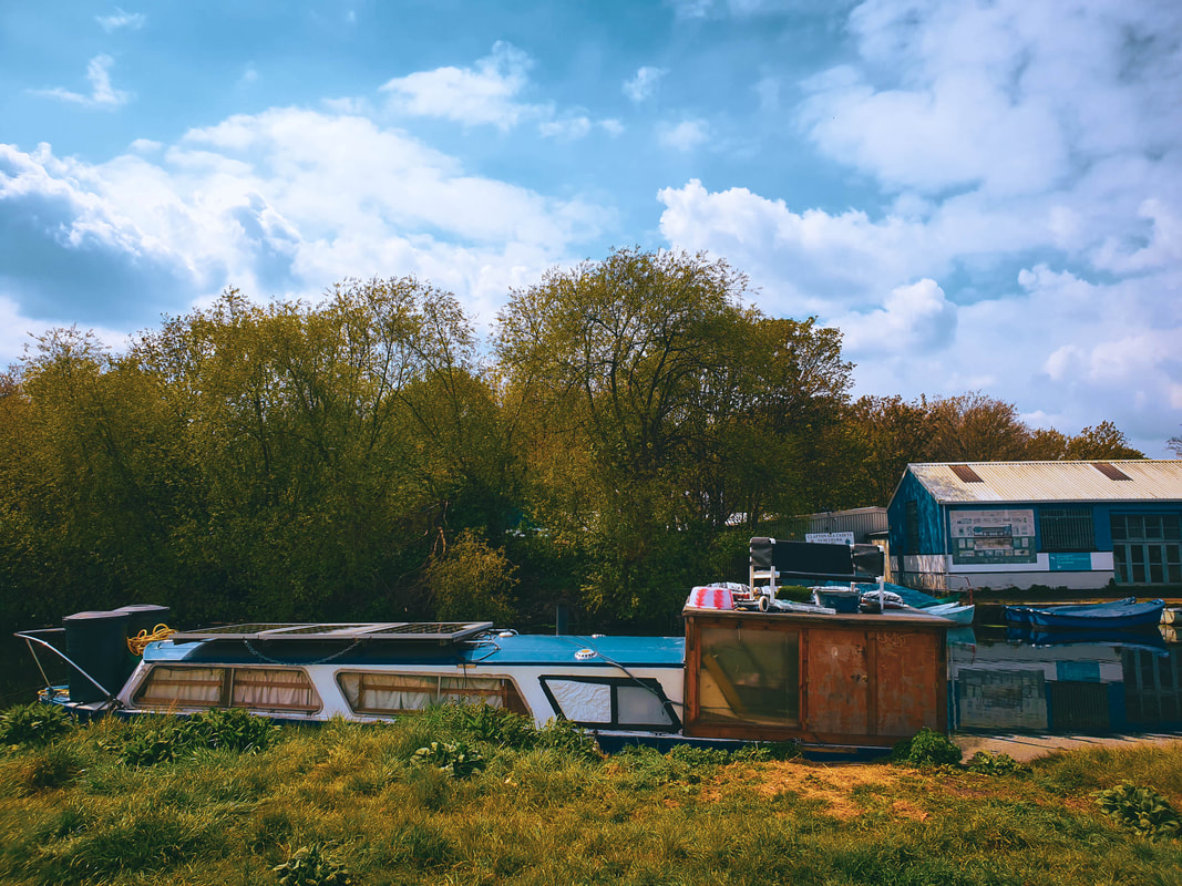
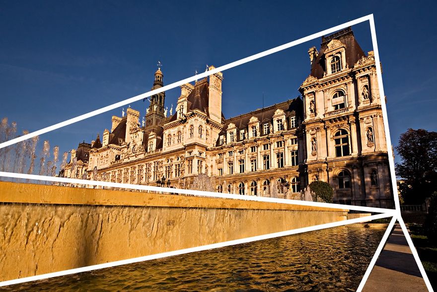
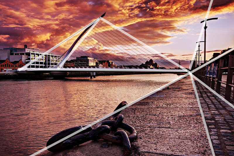
Triangles
This geometric shape in form of composition creates a sense of connection between three different points. These three points can interlink to create a triangle. In doing so, it creates a relationship between the three points which suggests stability within the photograph. Using a triangular composition are good way of grouping multiple elements into one cohesive geometric flow. A lot of photographers use triangular composition as they create an interlinking between the photo and triangles can be created everywhere. To do so, photographers will shift there perspective points in order to create the illusion of a triangle if at first the triangle is not obvious. This is a technique I tried to incorporate into my photographic style while taking these photographs.
|
|
My Response
Unedited
Edited
|

|

|

|
Annotation
I think the subjects I chose suited the theme because when you look at the triangles there are always so obvious. This is because I tried to find a good photograph and shift my perspective in order to create the geometric shape in that viewpoint. I think that I did this very well because it means you can find a subject that you think is interesting and convey how you are able to find a triangle in a new perspective. However, if I could pick something to improve in these photographs it would be my exposure. I think that I have overexposed my photos too much in the digital editing part of the task. Therefore, next time I think I should take more time in thinking about how I would like to light my photographs when digitally editing them.
Balance
Balance is where two objects that are similar in shape but have different weights, sizes, colours or brightness. The key important thig to balancing a photograph is that the objects are not symmetrical and have different weights. The theory is that having two similar objects in one photograph that have different weights balances out the photograph. This is effective because the juxtaposition of the objects contrast each other while keeping the similarity of a similar shape.
|

|
My Response
Unedited
Edited

|

|
Annotation
The subjects I chose to photograph suited the theme because they were similar in shape but different in weight. Having this difference in positioning and weight is what balances the photograph. To create this effect I decide to compose the objects on the third lines. This allowed the centre of my composition to draw the viewer into the space. My kept my camera on TV mode to prioritise shutter speed as it was particularly windy and I did not want any moving objects in my photo. Furthermore, I kept the ISO on 800 and the exposure at 0 because it was bright day already. Using all of these techniques allowed me to fully represent the technique of balance within my photographs. However, if I could improve my photographs I would have taken more photographs of balance as I felt that I had a limited range of photos to choose from in my editing process. I feel that if I had allocated more time to balance then I would have better examples to display.
Framing
In this task we were required to focus on framing and different perspectives. This included framing through mirrors, frames, fingers and windows. To do so, we had a split of homework photographs for windows and then a few response to styles and artists. I think that I did well to respond to the styles presented through this task. This is because I think I photographed the styles correctly and added my own unique spin to each style. I really found this Framing task really interesting because it was less about execution and more about creativity, which I enjoyed because I like showing off my creative and unique ideas in my photography.
Mirror Reflections

|
This is responding to an artist known as Sebastian Magnani. Magnani uses mirrors and their reflections to create an alternate yet interesting perspective. In doing so he will capture viewpoints that you will not normally tend to see in photography. By reflecting a contrasting object or viewpoint it stands out from the rest of the photograph. He would try and set the background different to the reflection so that you could really experience the different perspectives that Magnani tried to achieve in his photographs. Furthermore, he would use a centred composition so that the mirror was centred in the middle of the shot. This is a basic but effective type of composition because it focuses the eyes to the centre of the shot. This draws the eyes into the mirror, which gives a strong contrast to the background. This is achieved by the differing textures and the hard circular shape created by the mirror.
|
My Response
Unedited
Edited

|

|
Annotation
The subjects I chose suited the theme because nature really contrasted the dark gloominess of the car park and astro. This is because the connotations of a bin and hockey goal have extremely different connotations to that of nature, trees and the sky. I think that I did well to pick out subjects which really contrasted the background. I had set the ISO to 800 because we were outside and it was relatively clear and sunny. Furthermore, I tried to test out some more interesting compositions because I felt that that keeping the mirrors centred would be too plain. I tried to stray away from Magnani's style of centring the photograph because I felt testing the composition would create a more unique perspective. This also in turn gave the background more space to breathe. I think that I achieved this well because I contrasted the subject and background well. However, if I could pick something to improve on I would try and think about making my background more exciting because the bin and hockey goal don't have unique textures and are very plain.
Extension
|
In this task we had to create a filter for the cameras we photographed with. To do so we used a transparent plastic cup, we cut off the end of the cup and sellotaped an acrylic filter to the end of of the plastic cup. This created a coloured filter which distorted the natural colours of what you would see through the viewfinder. To further this, we added a roll of acetate sheet to the end of the acrylic filter. This created a round lens that focused on object, giving a sharp distortion between the subject of the photograph and the background of the photograph. This created a really distinct filter that coloured the natural surroundings of the photograph. I decided to use a red acrylic filter as I felt that it really stood out from the others. Furthermore, while photographing I noticed that taking photographs of metallic objects with the filter consisted of the best photograph. I think that this was because the day was sunny and hence the metallic reflections stood out while in the centre of the filter.
|
My Response
Unedited
Edited

|

|
Annotation
The subject I chose suited the theme because the day was sunny and hence the metallic reflections stood out and made the best type of the photograph with the filter on. This is because I centred the acetate roll so that it created a sharp line around the edges of the photograph from the background and subject. I think that I did a good job of learning from mistakes and finding the best object to photograph. To improve I could have I made sure that the acetate paper was better fitted on the acrylic filter because sometimes it swayed in the wind creating a blurry effect which I had not accounted for while taking the photographs.
Paper Frames

|
In this task we were tasked with creating a paper frame that we could look out of and photograph them at three different apertures. I kept the focus on the highest possible so that it only focused my fingers and the paper frame. I then adjusted the apertures on the three different photographs. This created a different depth of field for each of the three photographs. I wanted the composition to be basic and centred because I wanted to create the idea of looking through the paper frame into a different world. This was effective because it drew the eyes through the frame by being centred and created a strong distinction between the subject and the outer background. The aim for this was to create a photograph that gradually decreased in blurriness. I think that I really enjoyed exploring the different uses of depth of field.
|
My Response
Unedited
Edited

Aperture: f3.5
|

Aperture: f11
|

Aperture: f22
|
Annotation
The subjects I chose suited the theme because the graffiti was small compared to thick brick wall. This created a sense of space to view into the object because the background was similar to inside the frame, however, the graffiti makes the frame stand out because it contrasts the frame. Therefore, I think I created a cool sense of perspective and contrast between the frame and background. I kept the ISO at 1600 because it was a very grey and gloomy day. Furthermore, I kept the focus at the the highest possible so that the hand and frame were always in focus. This allowed me to really control the blurriness of the background with the aperture instead of the focus wheel. Moreover, I kept the composition centred so that it allowed the viewer to look through the frame with a sense of ease. I think that I did well to find good subjects, while creating a cool composition that allowed an interesting background to also come into focus. However, if I could improve the photographs I took I would maybe have increased the exposure of the photographs taken in South Wing as they were dark and could have improved a lot.
Windows
|
In this task I was required to photograph windows. I was given the option on how to illustrate this brief through my photos. I chose to portray the reflections of windows because I felt that I could create some cool perspectives to portray them. I did this by angling my camera in a different positions or finding areas where windows reflected cool images.
|
My Response
Unedited
Edited


|

|
Annotation
Formal Elements
|
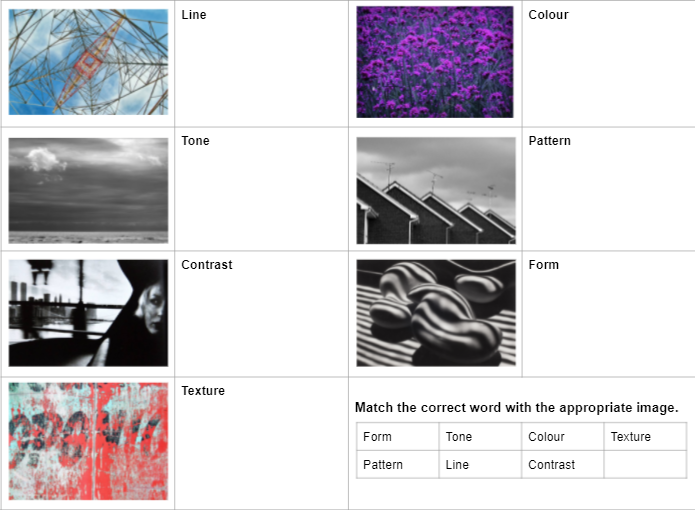
In this task I was required to capture the formal elements. The aim of this task was to respond to these styles so that you could integrate them into your future. It was very useful to learn about the seven things you could use to advance your photograph because it taught about the deep layers of annotation needed to achieve a more dynamic and interesting photograph. These seven techniques are called Tone, Texture, Colour, Line, Pattern, Contrast and Form. These techniques are a photograph is built and it is very important to include them as they help develop the photograph.
|
My Response
Unedited
Edited

Line
|

Colour
|

Pattern
|

Contrast
|

Form
|

Texture
|
Annotation
The subjects I chose to photograph suited the theme because they expressed the formal elements well. I tried to use my composition so that the subjects were centred as possible. I did this because I wanted to the viewer to focus on the element so that could fully understand the techniques that could be possibly used in my future photography. I had the camera on AV mode, which controls aperture. I did this so that I could manipulate how the depth of field appeared in the photographs. My intentions were to have the subjects as the focus piece of the photo. To do so, I set up a shallow depth of field. Furthermore, I complemented the shallow depth of field with a low focus setting, and this achieved the effect I wanted to go for. To improve these photographs, I would have reduced the amount of post photo-editing because as I reflect on my photographs I feel that it draws away detail from the goal I was trying to achieve. Furthermore, I feel that the location of the task was limiting due the fact they had to be taken within our school bubble. Therefore, it limited the amount of subjects I could have chosen.
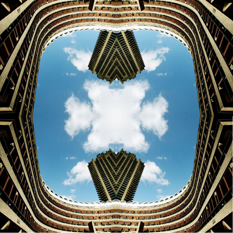
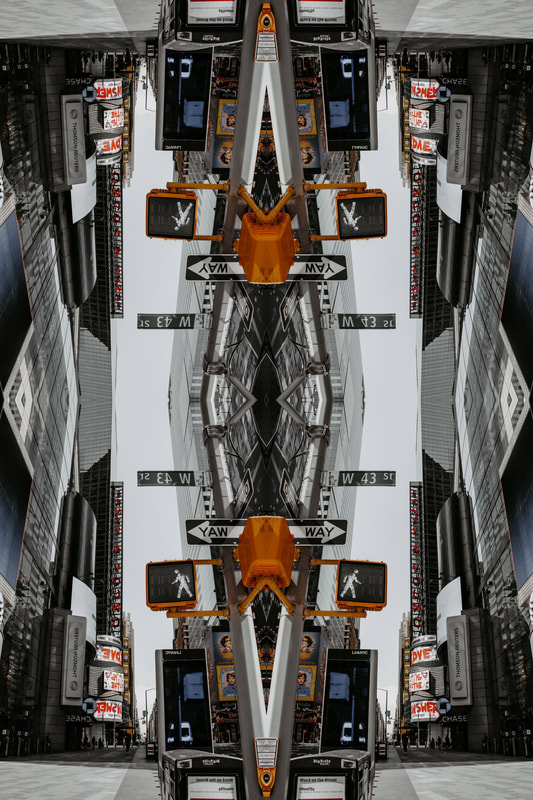
Workshop 1: Mirroring and Flipping
|
|
Annotation
I really like this technique because it allows you to turn a plain image into something more exciting. It adds depth and complexity to the photograph. This technique could be really useful if you wanted to create a cool optical effect or some extra dynamic to your photography. I don't think I would implement in my current project because it doesn't suit the theme of urbanisation for my independent development. However, I would try and implement into a different project if I saw that it could add a different perspective to my photographs.
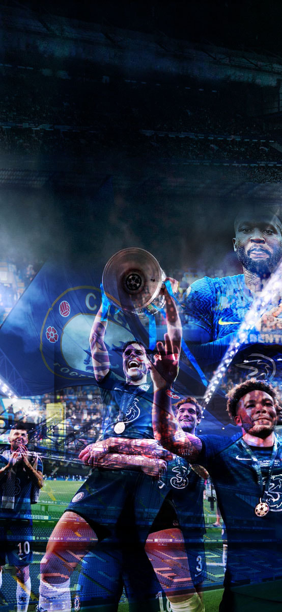
Workshop 2: Double exposure
|

|
Annotation
This is my favourite technique and am planning to utilise it in my final development. This technique is really useful for creating an image that looks dynamic due to the double layering of the photograph. I really like it because it allows you to create a surreal feeling, which I think will be useful for displaying the old ad new in my development.
Independent Development
Three Photographers
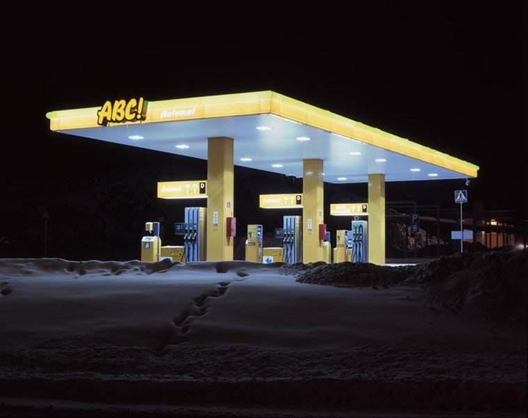
Matt Barnes "ABC", 2009
|
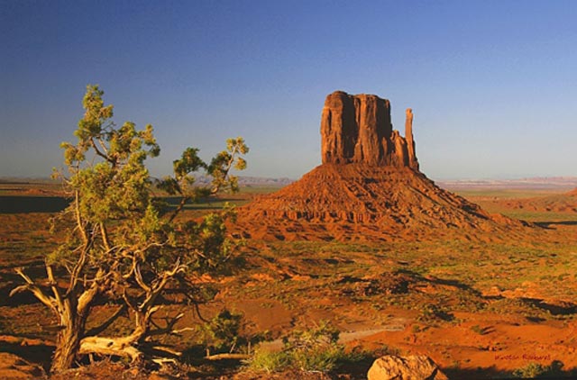
In this photograph Barnes intended to create a contrast between the neon lights of a gas station and nature. The photographer did this by contrasting a mankind creation with a natural creation. This is done by taking the photograph of the gas station at night so that it only captures the neon lights, which illuminate the scene. Furthermore, the night removes focus from the background so that the station is the main focus. Moreover, the illumination from the station lights up the picture perfectly so that the photograph is exposed at the right amount of light. The use of composition achieves a nice focus to the station, where the station is centred horizontally but not vertically. This is important because it makes the gas stations lie on upper half of the thirds of photograph. This allows for more contrast between the sand and station because it is angled so that the sand fades up to the station. It is almost as if the sand is a transition to station. This relevant because beaches, where sand is found, could be considered as a transition from land to sea. This speaks to the conscience contextual decisions taken by Barnes to fully create a fantastic photograph.
|

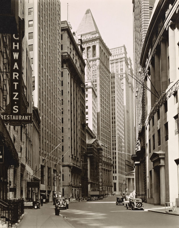
Berenice Abbott "Broadway", July 16 1936
|
In this photograph Abbott intended to create a sense of illusion and distortion while creating a sense of smallness for the viewer. The photographer did this by photographing the skyscrapers from street level. This created a sense of distortion because it captures the full height of building. The photographer wanted us to consider how she portrayed the buildings as a powerful object that towers over us as if it has control over us. This is significant because at the time in history, there was a lot of social depression and this led to drastic levels of unemployment. The way she has taken the photograph makes the viewer think that is portraying how at the time, society was very much controlled and influenced by financial status that stemmed from a loss in motivation within the workforce. I think she also wanted us to consider how we often lose sight of our purpose on the Earth, where her photography conveys that we need to fully experience each moment because it can change at any moment, this links in to how she was a social realist and wanted to show the drastic urbanisation and gentrification of New and York and Paris. Moreover, It is interesting how she considered her composition because it is framed so that the buildings engulf and trap the photograph. This interesting triangular composition is created through the sheer height of the buildings. Therefore, it looks as if the buildings converge together in the sky. This is use of composition is significant because the photographer used a high contrast to bring out the textures of the building using this triangular composition. During her lifetime, she liked to be very precise and wanted to render every detail with a high definition of detail. By using a composition that brings out the textures, it allows the viewer to fully experience the modern change within such a difficult time in history.
|

Brassai A Morris column in the fog, 1934 |
In this photograph Brassai intended to create a sense of romantic mystery due to the settings of his photography. The lights illuminate the fog and create a misty effect where the background is barely visible. The fog in Paris is a iconic part of the romantical side of the city and it really develops the look of the photograph. Furthermore, the grain that is used to achieve this effect, is done when the film that is used has a a low ISO. I think that Brassai really wanted to capture the beauty and love that you tend to see in the noir era of romantic films. He is extremely good at achieving this effect because he chose a setting that has connotations as a city of love and made good photographic decisions. I really like how the fog softly contrasts the Morris column because I think it makes the composition of the column stand out more. This is attained by putting the column on the far right third line and this composition allows the viewer, space to view into background. This is significant because it adds a certain sense of tranquillity to the scene that is very particular to the style. Brassai really wanted the viewer to consider how he chooses his photographic methods so that they could to try and understand and appreciate the stylistic genre that Brassai loves so much. Moreover, Brassai uses a higher exposure so that the light fully illuminates the scene and adds a further calmness to the scene. It is also interesting how Brassai shot the photograph at night where the night sky would not be visible due to the immense amount of fog. This is significant because it further adds to how Brassai has built up the scene through his unique photographic methods.
|
My Favourite Photographer
|
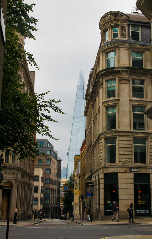
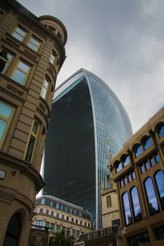
I really like how Berenice Abbott can really capture the physical height of each skyscraper while representing the message of how powerful and controlling they can be. Because it links into the depression just before WW2, I really found it interesting to analysis and break down the photographer's intention and message behind her photographic style. Furthermore, once I really understood her style I decided that the City Central would be perfect. My Mum had suggested Archway, however I though Central London, specifically the financial district and tourist areas would fully capture the control society wraps us in. The City used to quite rough however it went through a rapid phase of gentrification and became very urbanised to replicate the skylines and buildings of New York. Therefore there is a clear direct influence in The Financial Banks from the New York and that can be seen in the architecture and textures used in the current London banks. However, it is important to notice that due to differing time periods the feel of the photograph, and textures captured, may be contrasting due to the resources and architecture available during the time of Abbott's photography.
|
Development 1
My Response
Unedited
Edited


|


|
Annotation
The subjects I chose suited the them because they directly link to the theme of urbanisation that is so present in Abbott's work. I chose buildings that were cold, bold, and towered over you. The sense of sheer height is really brought alive in my response and I wanted to make this apparent. I did this because I wanted to viewer to appreciate how urbanisation has made looking at the this sheer spectacles possible. I wanted the viewer to feel humbled by how small humans are in comparison. This is how Abbott intended to portray her work, so it is important that I do so too. My composition really fitted this idea because the majority of the building cover the space of the photograph. This allows for less background objects and more direct focus to the buildings. Furthermore, in my photographs there are a lot of triangular structures. This developed the Abbot's idea of introducing more height seeing as the building converge together. Moreover, I tried to keep the ISO at a daytime ISO keeping it around 400. However, I had chosen a bad day to take these photographs. This is evident because there is barely any detail in the sky. I wanted the sky to directly contrast the buildings due to the nature vs mankind theme. I was not successful in doing so, hence that could be something I could improve on.
Development 2
In this task I was required to improve upon my photos from development 1. My feedback was try and avoid having background objects interfere with my photos. I tried to take more photos with less background elements but some photos looked odd when I cropped them. Therefore, there are some photos that fit this brief and some that don't Another target for me was to get a more dynamism in my photos by taking photos on a sunny day. This target was easier for me as I took the photos in Spain. My intentions for these set of photos was to show the old and new of Valencia and show how they contrast each other. I tried to make it so that you have buildings that are very rich in texture, due to their antiquity, and then very new structures that are cold and metallic. Overall, I think I fit the brief well of improving my photos. The techniques I used to edit the photos on this development are much more advanced and I think it shows.
Unedited
Edited
Best Edits

|

|

|

|
Annotation
The subjects I chose to photograph suited the theme because they directly contrast each other in terms of their style and stature. I wanted to make this clear because they suit the theme of urbanisation. This encompassed including old and new buildings to directly show the effects of the government's decision to urbanise, or leave certain parts of the city. This theme is clearly presented throughout Abbott's work and I wanted to make it clear through my response to her too. I did this by selected certain photographs that really emphasised this idea. My selection process included looking at the composition and detail in the photograph. This meant picking photographs that had been mostly centred, and had minimal background distractions. This allowed the viewer to focus on the building itself and really notice the integrity of the structures. Furthermore, when taking the photos I kept the camera on the lowest exposure and ISO possible to draw as much detail out of the sky and the buildings. This was significant because it allowed to develop the theme of nature vs mankind. However, to select my photos I used masking and bracketing certain parts of the photograph. This allowed me to re-exposure certain parts of the photograph without losing the details I wanted to obtain. This also gave me a smaller group of photographs to choose from as not all photographs worked with this technique. If I could improve something I did, it would be to have taken less photographs because I feel that having such a wide selection of photos could have degraded the quality of them slightly. So a target could be to focus on quality over quantity.
Gallery Visits
| tristan_calvinos_gallery_review_1.docx |
| tristan_calvinos_gallery_review_2.docx |
Development 3
My Response
Unedited
Edited
|
|
Annotation
I think that this response was very successful in capturing both nature and manmade. I think that I repsonded well to this brief and I was more enlightened about what my final piece should be. I took the photos at 1200 ISO as it was a very grey day so I had to bring out the highlights of the photo by upping the ISO. I also used a TV mode shutter speed priority of 1/60 to make sure there was no motion blur and that aperture wouldn't interfere.
Final Piece 1
In this task I was required as to decide what I wanted to portray as my final piece for the landscape project we have been working on. I wanted to display the theme of old vs new in one clear photograph in this final independent development. This entailed layering both of the photos to capture the perspective through the ages. I wanted to utilise this effect to develop the idea of how urbanisation affects society. This due to how we interact with the technology around us and it is effective to see how it changes over time. Furthermore, my project started with me exploring the works of Berenice Abbott and how she portrays society's interaction with urban landscapes. However, my project then developed to portray the changing of these landscapes over time. I, therefore, thought that the development would be fitting to be my final piece as it wraps up how we look at urbanisation. This is because fitting this change in a singular composition is how I chose to finish this project.
My response
Edited


Annotation
The subjects I chose suited the theme because they related to their old areas and how they have changed over time. I think that I did this project really well because I found areas that have personal connections with me and conveyed their journey through time. How they have been urbanised and remodelled into the modern places we know today. I tried to capture the old part of the photograph in the middle to achieve a centred composition. I had my ISO at 400 and this was because the weather conditions were nice and sunny. I think this project has ended well in the since, I feel that I have captured the true sense of development between old and new to best respond to Berenice Abbott. However, if I could improve this project I would work on the scaling of the old photographs. I really found it tricky to find the best perspective to match up both photos in my editing process. The areas have changed and therefore it was hard to find an exact match but I feel I could have gone about the matching better.
Final Piece 2
In this task I was required as to decide what I wanted to portray as my final piece for the landscape project we have been working on. I wanted to display the theme of old vs new in one clear photograph in this final independent development. This entailed layering both of the photos to capture the perspective through the ages. I wanted to utilise this effect to develop the idea of how urbanisation affects society. This due to how we interact with the technology around us and it is effective to see how it changes over time. Furthermore, my project started with me exploring the works of Berenice Abbott and how she portrays society's interaction with urban landscapes. However, my project then developed to portray the changing of these landscapes over time. I, therefore, thought that the development would be fitting to be my final piece as it wraps up how we look at urbanisation. This is because fitting this change in a singular composition is how I chose to finish this project.
Unedited
Edited


|


|

Annotation
The subjects I chose to photograph suited the theme because they contain historical roots that link back to their old landscapes. This is effective in portraying the change in urbanisation through a singular composition. I used my composition to frame the new photos in relation to their older counterpart. This involved matching up the third lines and their components within. This allowed me to match up each photograph easier as they contained the same perspective. I wanted to keep the photograph exposure relatively bright so that there was a contrast between the darker old photograph. I made sure that the ISO was complimentarily to the type of the day I took the photographs. I kept the photograph on a TV mode so that i could capture any movement with the shutter speed priority. This meant keeping the photograph on 1/200 shutter speed to capture the movement. This was essential because I wanted to fully gain the details of the cars, so that they could contrast the older cars. I made sure that that the colours in the newer photographs were crisp by increasing the saturation and vibrancy in my editing process. I also altered certain saturations of certain colours to draw out a direct contrast to the old photograph. I then used the eraser tool on Adobe Photoshop to fade the two photographs together. All of these techniques allowed me to build a full contrasted photograph that displayed the theme of old vs new. However, if I could improve my photographs I would have chosen a better day to take my photographs because they was very few details in the the sky. This is bad because it doesn't show a contrast between the sky in the old vs in the new. Allowing for a fuller sky with more colour depth would contrast the flat sky of the old photograph. I tried to remedy this in my editing process but with some photos I was unable to draw anything out. Therefore, to make it easier I would have chosen a better day to photograph the new photos.
