
JR Chronicles – Saatchi Gallery
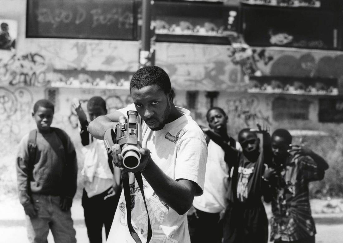
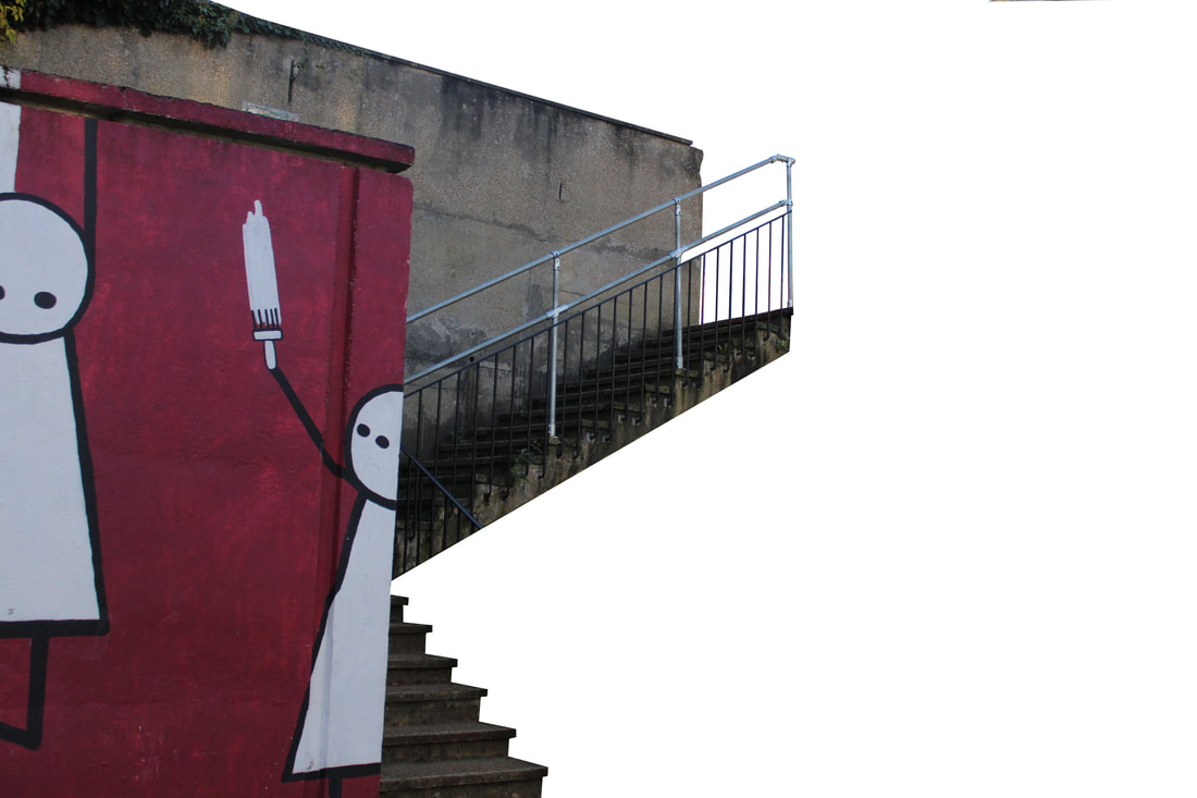
JR is a French photographer, who started at as a graffiti artist at age 15. As he progressed, he found a 28mm lens camera on the Paris metro, and wanted to display the experiences that he and his friends endured when doing this graffiti work. Once the photographs were taken he set up the "Expo de Rue" ( a sidewalk exhibition), where he pasted the photographs onto sidewalks and streets. This was where JR's story began because it was the first time JR was expressing his work through the medium of pasting. It was also the start of his photographic career that has became the popular display that it is today. I really enjoyed experiencing JR's exhibition at the Saatchi Gallery because it invoked a feeling within me that made me think about the disparity that poorer people experience. This included the discrimination of certain religions or minorities that JR went on to photograph later in his lifetime. I also found it interesting to see the development in JR's character because in his 2011 TED talk he said, "the city is the best gallery I could imagine." He said this to explain the reasoning behind his "Expo de Rue" project, that he felt putting the art in a gallery would be an oxymoron to the idea behind his photography. As we know though he did an exhibition at the Saatchi Gallery, which directly contrasted his earlier belief. This development shows how JR has changed since he started and I find it significant.
Face 2 Face
|
In JR's Face2Face project , JR went out to photograph Israelis and Palestinians to show they are more alike than the news portrayed them to be. He wanted to give the people a voice to convey to the government to spread peace. He did this by photographing both Israelis and Palestinians with the same job, and pasting them next to each other. I particularly liked Face 2 Face because I found it really enriching to see the Israelis and Palestinians expressions. The way that JR had focused on a point where the people were happy invoked a feeling of joy within me. To see these people, who have endured the meddling of western influences for decades, in a state where they were cheerful made me feel happy. It encouraged me to view the people as similar, which contrasted what I saw in the news about their conflicts. Moreover, the way people who then viewed the display could not differentiate the faces of the Israelis to the Palestinians also made me happy. This was because it enlightened the fact within me that we are all the same human race and I really liked the way JR conveyed this. He saw that on the news there was conflict but in reality he discovered otherwise. His passion to prove that people should value peace over conflict really speaks to me. This is why I love his message throughout this project.
|

|
Portrait of a Generation
|
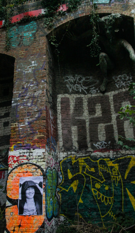
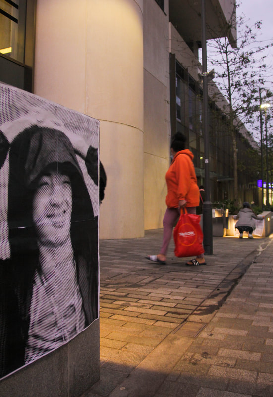
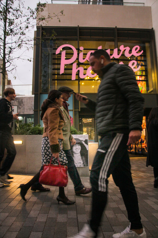
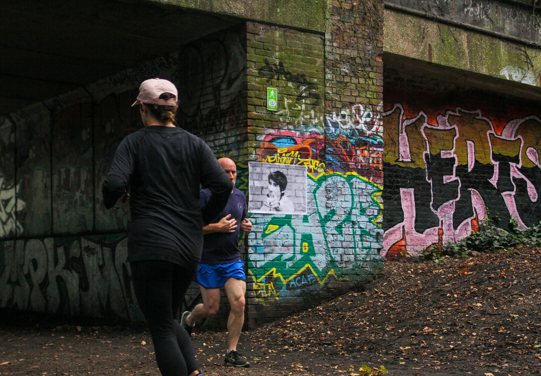
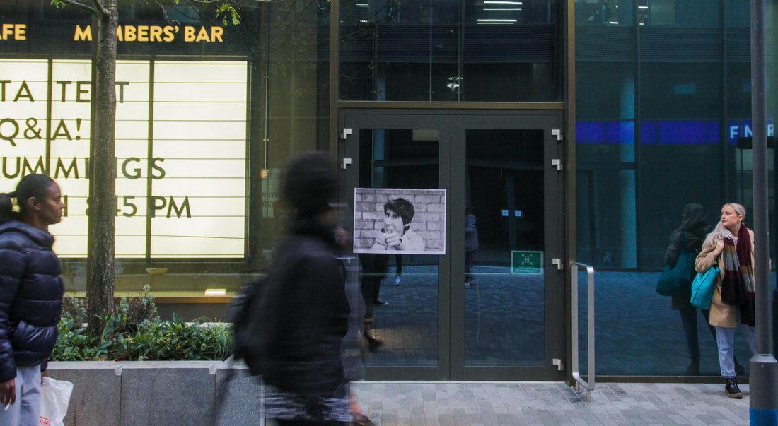
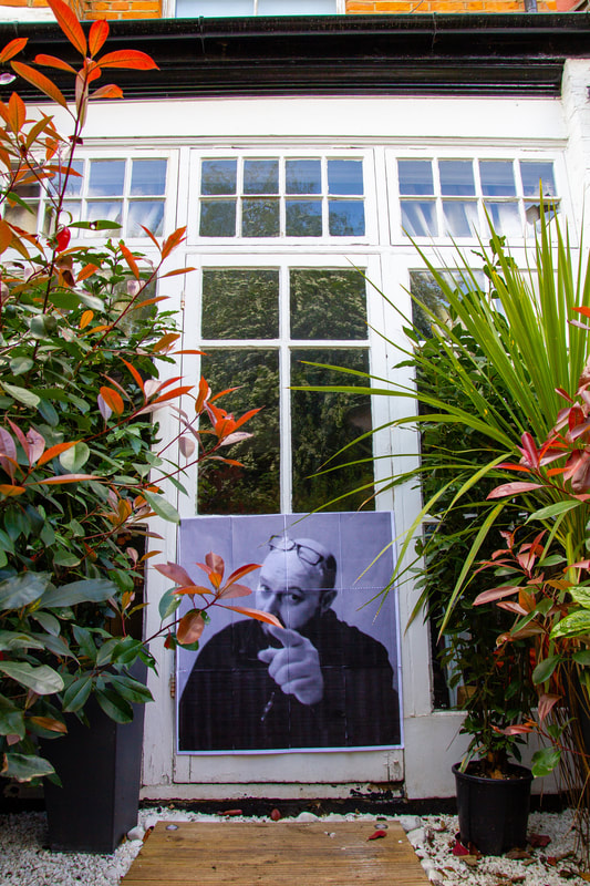
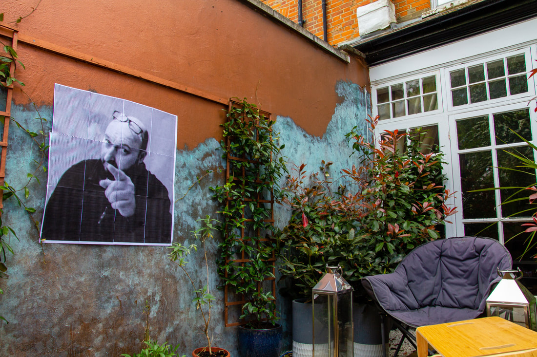
In this task I was required to respond to a project that JR did in 2005. He was looking on the news and found that one of his images was on the news. The news falsely represented his friend and labelled him in a bad light due to the Los Bouquets riots in Paris. He decided that he wanted his friends to reclaim their identity and show the news reporters that they were not like they had perceived them to be. He took a 28mm lens and took their portraits, he then blew them up in scale and pasted them around the city. He wanted to their portraits to allow them to reclaim their identity and this was achieved in the funny faces they pulled. I chose to respond to this task by photographing one of my classmates. I blew up his image in scale and pasted it around Finsbury Park. This allowed him to reclaim his identity as JR wanted.
|
|
My Response
Unedited


In Location
Edited

|
|
|
|
Annotation
The locations that I photographed suited the theme because they are in everyday locations and allow me to portray my identity in my own way. This illustrates JR's message perfectly as I am expressing myself to the world in the way I want to seen. I took this photographers with an 800 ISO as it was a very grey day, so I had to pull out the highlights with a higher ISO. For my composition, I either framed the poster in the centre of the photograph or on the third line. so that I could show that the poster was the most important part of the photograph. I think I did this task well but I could have done it better by using a tripod as it would have made my photographs look less shaky.
Gordon Magnin
|
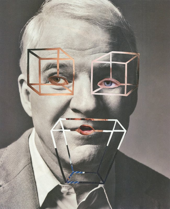
Gordon Magnin is a Los Angeles based photographer who manipulates the iconic faces that populate Hollywood. He fragments geometric shapes to alter the appearance of some of the most well known celebrities of this era. Magnin has a blind left eye, which severely impacts his depth perception. However, Magnin made use of his disability to further develop his geometrically altering effect that is so common is his work. Magnin wanted us to consider how these geometric shapes are uniquely special. He wanted his photographs to stand out and make people re-evaluate how they classify different objects.
|

|
|

|

|
My Response
Unedited
Edited

|

|
Annotation
The patterns I chose suited the theme because they distort my portrait in a way that makes the viewer consider the distinctiveness of the shapes. They make the original portrait hard to view, however they also make the viewer think about the process I used because the rotation allows them to see the abstract nature of the manipulation. I wanted to use these shapes to distort the photograph, but not too much so that the viewer can't appreciate it. My composition supports this because the portraits fill the majority of the space, leaving very little background space. The effect of this is that the viewer really focuses on just the portrait without the background, leaving no distractions. I left my ISO at 800 to emphasise the features of my portrait that weren't distorted. This creates a subtle contrast between the detail that is easy to see and the detail that the viewer has to think about to see. To summarise, I think that I created a good effect that makes the audience think about the distortion and its individuality. However, if I could improve my photographs then I would add more layers of clothing so that they could distorted further.
Kehinde Wiley
|
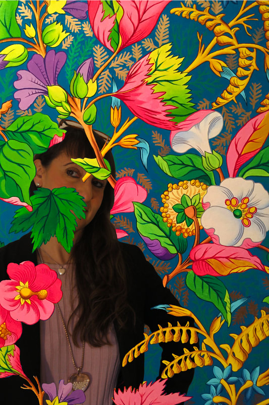
Kehinde Wiley is a black artist, who recreates old oil paintings with a modern twist. He chooses his subjects on the streets of the New York, who then choose a painting to recreate. In doing so, Kehinde allows them to reclaim their identity, and portray to society that they are not how they media perceive them to be. Posing them in a powerful pose illustrates how they have an heir of power. Due to large size of painting, we also that the subject looks down on us, which also conveys the power they hold. Furthermore, giving black citizens a platform to change perceptions about them is very powerful. This method is very similar to the method behind JR's Portraits of a Generation exhibition. Kehinde wanted to display a new history of art, which juxtaposes the white male narrative that we normally see in older art pieces. He sets out to create a similar composition to the older portrait, but with a different background. The new floral pattern background emphasises the focus of the painting, while also creating an underlying abstract theme. To conclude, I think that his idea about trying to combat the lack of black culture in art is very strong and powerful message. This message really resonated with me, which is why I really like his work.
|


|
My Response
Unedited
Edited

|

|
Annotation
The subjects I chose suited the theme because they evoke the same feeling of power. The pose illustrates that the subject is powerful and this is significant in removing assumptions about race, gender or wealth. It helps to reclaim the identity of the subject. For me, I hold music as a powerful theme, therefore, I wanted to portray myself as a musician to convey this idea. This links back to the message Wiley wanted to emphasise. I used my composition to signify the theme by lighting my face instead of the rest of my photograph. This allowed the viewer to focus more on my facial expression which conveys power. I kept the ISO at 200 because I wanted a darker photograph, this allowed for a stronger contrast between my face and the rest of my body. Therefore to conclude, I used my pose and facial expression to express to the audience the power that I hold in this photograph. However, if I had to improve my photograph I would make the outline of the patterns, which layer my photograph, tighter and more precise. This would emphasise the layering in the pattern more. Therefore, a target for my next development would be to make the layering of pattern tighter in the editing process.
Powerful Poses
My Response
Unedited


Edited
Annotation
The subject that I chose suited the theme because it portrayed a woman in a powerful pose who chose that specific image. This response was a great sucess because
Building Fragments
Patrick Cornillet
|
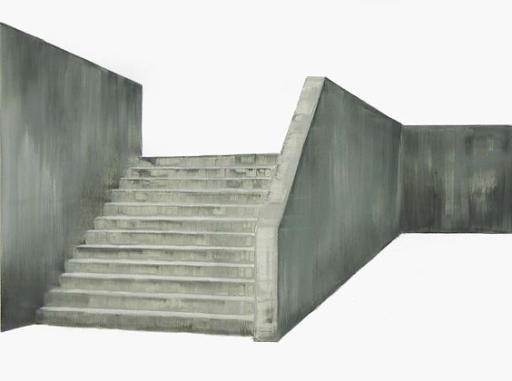
Patrick Cornillet is a painter who paints concrete structures with no background interference. He portrays architectural landscapes at a corner angle to create a unique perspective. He wants us to think about the wealth and richness of the concrete and how it will always remain where there is no human life. The juxtaposition between the concrete and the background creates a strong feeling of contrast between the harsh material and the softer colour. This technique is breath taking and very eye opening, which is what makes his work so special.
|
|
Step-By-Step
My Response
Unedited
Edited
|
|
|
Annotation
The subjects I chose suited the theme because the buildings are cold in texture. They are dirty and would be repulsive when looked at, but this suits Cornillet's theme because he wants to highlight them and show them off. He does this because he feels that the concrete structures hold a certain purpose to remain the same even with no human life. I think that he values concrete structures because of how special and unique they are. To do address his intentions I set my ISO at 800 to bring out the textures that the concrete has. I set my composition at an angle so that capture the perspective of the buildings when they are not straight on. This was effective in my final edits because I think that the angles allow the structures the more strongly contrast the background. I kept my camera on TV mode because I think that prioritising shutter speed over aperture allowed me to capture the whole of the structure in detail. If I had set the camera on AV mode I think I would have lost some of the detail in the buildings. I think that my response to Patrick Cornillet's work was good because I addressed his message of capturing the beauty of concrete well. However, if I had to improve my message I would make sure I had cut out all of the background because they are some pixels that I missed accidently that need to be remedied for the response to be better.
Extension
Cornillet likes to experiment with the backgrounds he uses sometimes. This involves replacing the white background with an image of the sky. This could add a layer of contrast in his photos that develops upon his theme of concrete structures. Therefore, in this task I took my edited photos that I took and replaced the white background with an image of the sky I got of the internet.
My Response
Annotation
For this extension I cut out the white background for the original Cornillet edit and I replaced it with a sky. Sometimes, Cornillet doesn't have a white background and has a sky background instead, therefore we had to respond to both styles. I found the image of the sky online and pasted it into the original Cornillet edit. For this task, I think that performed the task well providing a good response to Cornillet's style, however if I had to improve my response I would replace the blue sky with a grey sky because I feel that it would juxtapose the building better.
Mauren Brodbeck
|
Mauren Brodbeck is a photographer who replaces the bland uninteresting buildings in his photographs with bright vibrant colours that emphasise the silhouettes of the buildings. He does this because he wants his viewers to understand how had he not changed the colours that the buildings would be overlooked and dull in their eyes. The perspective that he captures and the bright colours allow the buildings to viewed in a different light, thus giving a new insight into how we view buildings in general.
|

|
My Response
Unedited
|
|
Edited
|

|
Annotation
The subjects I chose suited the theme because they are buildings that would normally be overlooked. This conveys the intentions of Brodbeck because she wants to bring neglected buildings back to life. My composition developed this theme because I photographed the buildings at an angle and this helped to make the outlines of the buildings more aesthetically pleasing for a viewer. I set my ISO at 400 and exposure at -1 because I wanted to make the surroundings darker. Thus increasing the contrast between the surroundings and the solid colours. I think that I captured some interesting outlines of neglected buildings, and I enjoyed bringing these structures back to life. However, if I had to improve my work I would have captured some more irregular buildings with a wider lens. I think this would improve my response because I feel that the outline of colour in an irregular building would be more interesting than a more rectangular looking structure.
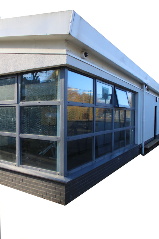
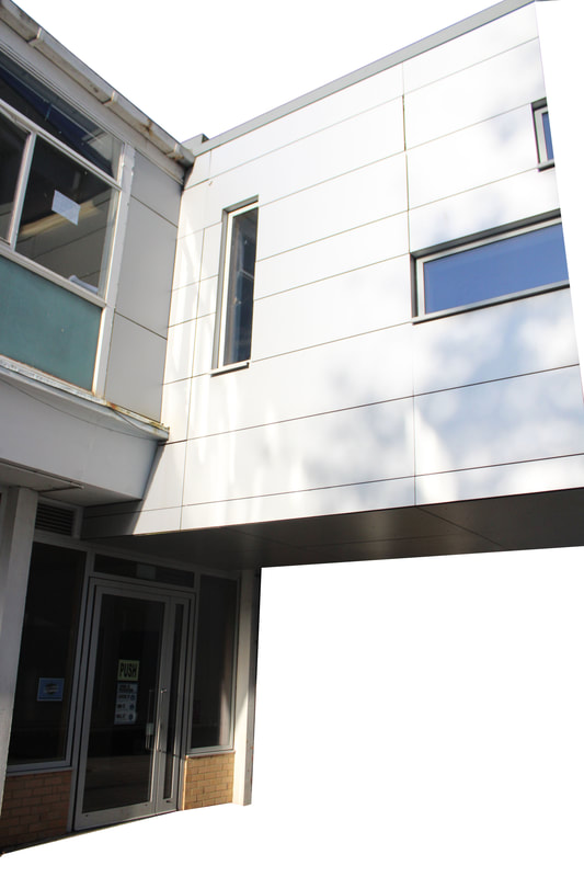
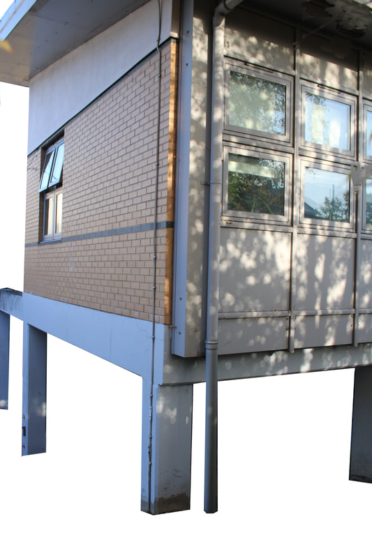
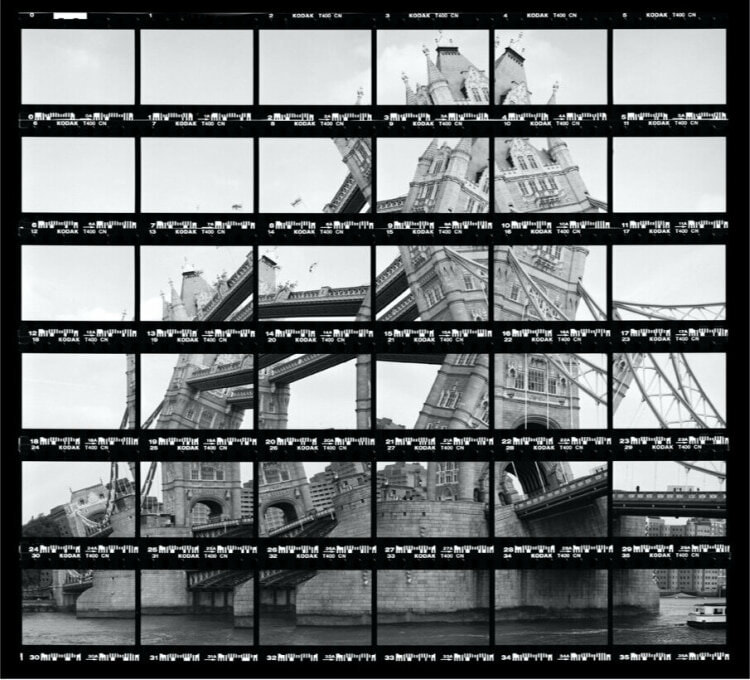
Thomas Kellner
|
Kellner photographs segments of buildings and reconstructs them in a contact sheet. In this task, we were required to break down the building into different sections and photograph each section individually. This was so that we could collect the photographs in are post editing process and put them into a contact sheet. This technique is effective in creating a visual distorted perspective as you view the whole contact sheet. This technique reminded me of the older task we did responding to David Hockney because the process behind the fragmented photographs are similar. I enjoyed this task because the contact sheet is a new effect we have not worked with and I find it interesting how the individual photos come together to recreate this big sheet. Only be viewing the photograph piece by piece can you really take in this effect and I like how the photographer makes the viewer analyse his method by fragmenting the building.
|
|
Step-By-Step
My Response
Unedited
Edited
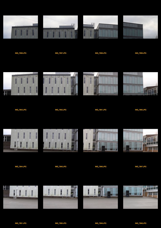
Annotation
The subjects I chose suited the theme because the building changes in texture as you progress from each photo individually. My composition framed some of the fragmented building twice, this helped to recreate the perspective we see in Kellner's work. I set the ISO at 800 because I wanted the textures of building to be strong. I knew 800 ISO worked because 1200 was too high and I lost detail in the textures. My images express my intentions which were to replicate the fragmented perspective that Kellner uses in my own response. I think that the idea was expressed but I feel I could have improved the distortion better had I added some more rotation and distance in each individual frame. Kellner's work is usually more distorted than my response, so if I were to improve my response I would distort the images more.
Anastasia Savinova
|
Anastasia Savinova is a photographer who colleges fragments of buildings together. She takes different buildings with contrasting textures to fully make the viewer understand her message. She wants to capture the feeling of everyday life and the journey you experience throughout it. I like the way she tries to stick to buildings that have similar colour schemes as they slightly change through the photograph. This gives a nice perspective that you can see in her work and I really like the way she has executed the idea. In this task we had to respond to her style and to do this I went to South Kensington so that I could capture the rich and poor textures that you are able to see there. The white iconic small apartments really contrast the neglected ugly council estate flats. Growing up near the area, I was aware of the certain areas that really capture the style I wanted to recreate. Therefore, I photographed fragments of different types of buildings in South Kensington to create a very good response to Anastasia Savinova.
|

|
Step-By-Step
My Response
Unedited
Edited

Annotation
The subjects I chose suited the theme because they progress in texture and colour like we see in Savinova's work. I wanted to capture the contrast between the council estates and iconic luxury apartments that you can see in South Kensington. I wanted the marble textures to strongly contrast the gritty exposed brick in these photographs. To do so, I set the ISO at 200 because I took my photos on a cold, grey winter day and the textures felt my distinguishable under a low ISO. I zoomed in slightly so that my lens adjusted from 17mm to 35mm. I was able to do this because I have a very wide lens that stretches from 17mm-70mm. After I had zoomed in I then went photographed the building in fragments gradually progressing around the building. I set my composition this way as if I were doing a response to Thomas Kellner because I wanted to capture small details in each individual frame as I progressed along the building with my lens. This was effective in collaging the photos in my editing process because it saved me time trying to cut out the details I wanted to use. I think that I responded to Anastasia Savinova very well and I captured her message of everyday life perfectly. However, if I had to improve my response I would replace the 3rd highest photograph on the very left because I get some teacher feedback that it stuck out and should be replaced to create a better response.
Independent Development
First Strand
Petey Ulatan
|
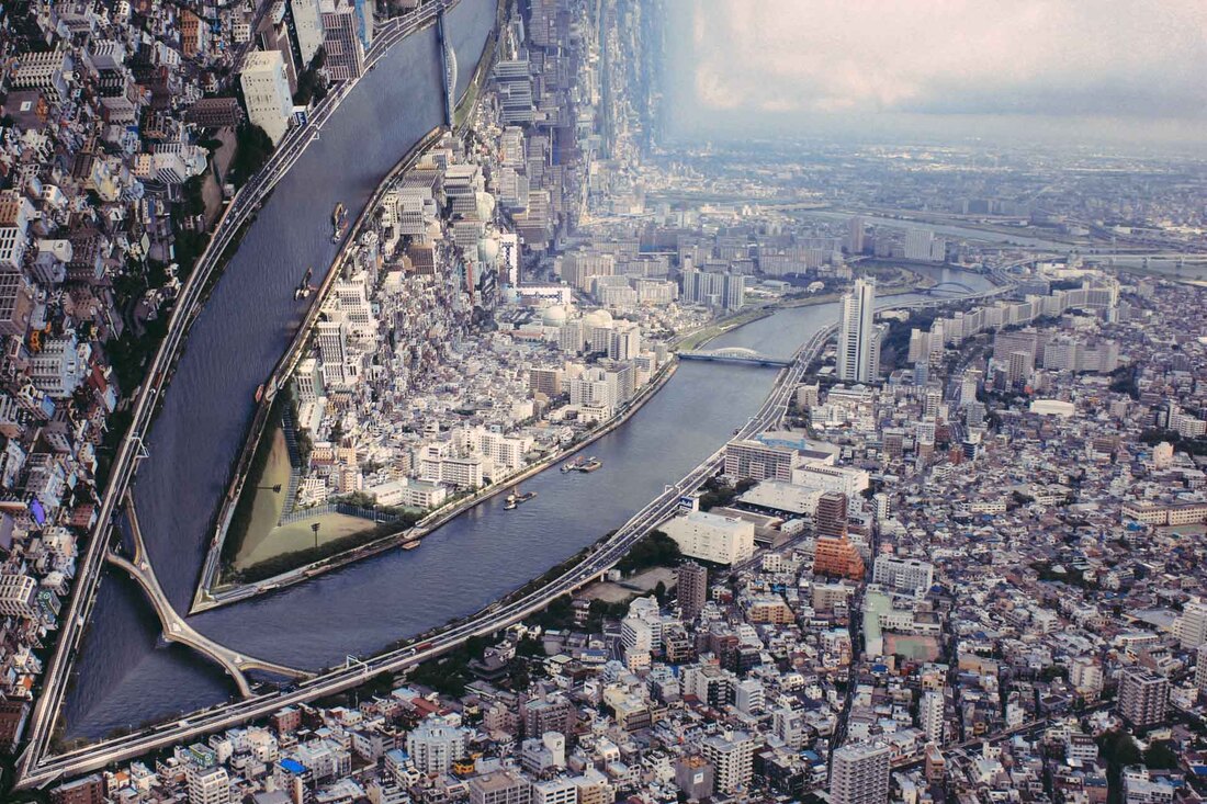
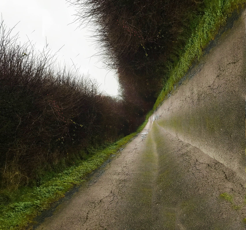
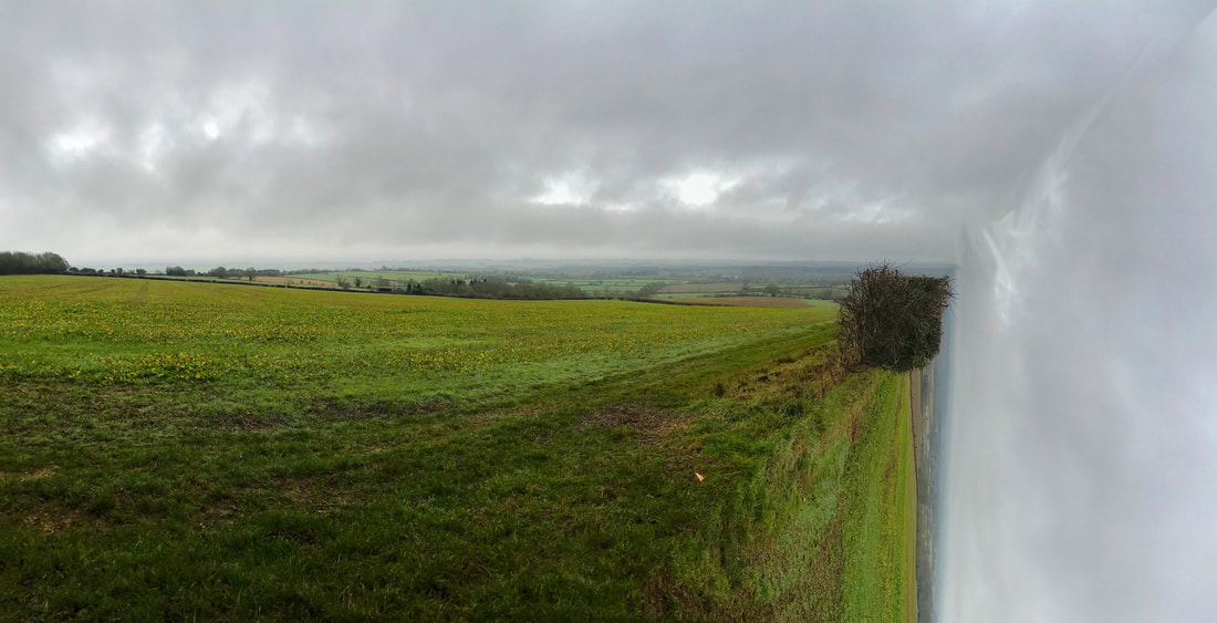
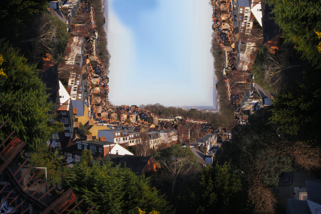
Petey Ulatan is a photographer who is interested in architecture and how the world would look as a cube instead of a sphere. He is very well-known for his "Folding Images" project which looks at how images how can be distorted and fragmented to create such effect. He normally takes building landscapes and pursues how they can be altered to portray the effect seen in the well known film "Inception". This idea grabbed my attention because Inception turns out to be my favourite film and the effect peeked my interest. I really like how Ulatan created this unique effect and hence I wanted to respond to the idea for my independent development for "Fragments". Furthermore, I would like to add that I would add that for this project I wanted to portray the effect in nature and in an urban landscape to see which landscape would produce a better effect.
|
|
Step-By-Step
My Response
Unedited
Edited
First Attempt
Second Attempt

Annotation
.The subjects I chose suited the theme because they illustrated the "Inception" folding image technique that we saw in the Petey Ulatan "Folding Image" project. This was effective in portraying the dystopian futuristic idea that he has off what the world would look like as a cube. I think that some of the images work better than others for example, I really like the wide panoramic of the view in the Cotswolds and the last image of Stratford's Westfield Shopping centre. I feel that these images work the best because the distort line is more visible in those photos than in my others. The line being more visible is more effective in portraying Ulatan's message and therefore I think they worked best. I used a shutter speed of 60 with my camera prioritised on TV mode because I felt that controlling the shutter speed would be more effective than controlling the aperture. I kept the ISO at 800 in the Stratford photos because the weather that day was good and therefore bright. However, in the Cotswolds the weather was more grey and I felt that an ISO of 400 would have been more useful. This allowed me to under expose my photos slightly so that I could better re-expose in my editing process. I think that this effect worked really well but if I could improve it I would take out and improve the penultimate image because I received feedback that the effect in that photograph wasn't as clear as the others
Second Strand
Giacomo CostaGiacomo Costa is a photographer from Florence who is very interested in nature and architecture. He set up his Floornature project as a way to portray the oppressive creations of man and how they have impacted our society. In his project, he took photos of cities decontextualized and portrayed them to insight the overbearing greed we as society have. This was his message he wanted to illustrate to the viewer. He wanted no people to be present in his photographs because he wanted to remind the viewer of their behaviour and their wicked acts. Costa is very concerned with the environment and the impact we as humans have on it. He felt the harsh textures of the buildings would make the viewer reflect on their own impact to the environment. I was very interested in Costa's work because I myself am very environmentally aware and one day would like to work in a green energy company. His message really spoke to me and during my stands I pondered upon how to best represent his work in my response. My uncle lives in Stratford which has been heavily gentrified due to 2012 Olympics in London. I thought that portraying this urban area would convey Costa's message quite well because the carbon footprint of the 2012 Olympics was quite high.
|


|
My response
Unedited
Edited

Annotation
The subjects I chose suited the theme because the textures of the buildings conveyed the urbanisation of the the Stratford area. I found that the buildings were all high rise buildings and luxury apartments and were made as a way to supply the influx of olympians and tourists that came over for the 2012 Olympics. The environmental impact of these buildings are huge and I thought it would represent Costa's message extremely well.
Third Strand
JR
|
JR was a photographer that we went to go visit earlier in the project. We recreated his "Portraits of a Generation" project, where he takes portraits of people and posts them in random locations. He saw that his friends were being wrongly presented in the news and he wanted to give them an opportunity to reclaim their identity. I really enjoyed doing this response previously and I wanted to give it a go again so that I could perfect upon my response. For this response, I took photographs of my uncle and gave him the opportunity to express himself in my photography coursework. He helped my mum raise me as an early child as my mum dealt with being a single parent in London. I have a very strong connection with my uncle and I thought it would be a perfect opportunity to spend more time with him and give thanks for being a father figure in my life.
|

|
My Response
Unedited


In Location
Edited
|

|
Annotation
Click here to edit
Development 1
For this development, I wanted to combine Giacomo Costa and Petey Ulatan because I really liked both photographers. For the week that this was due, I had exams so I didn't have much time to take my own photographs so I took my second stand final edit and applied Petey Ulatan's style to it. This was to get an idea of how I wanted to combine both styles and what approach to take to get the best outcome. This development really helped me to understand how to best edit my photographs and select the relevant cuts in the photograph to merge Ulatan's architectural cube effect with Costa's message of carbon neutrality. The heavily distortion in the edit for this first development illustrated to me that having all buildings like Costa without any contrast would turn out poorly. Therefore, I used this first development as a sample to navigate the best possible combination of both styles.
My Response
Unedited
Edited
Annotation
The subjects I chose for this photograph fitted Costa's theme of overarching urbanisation and how destructive it can be to the environment. I combined this effect with Ulatan's Folding Images, which also illustrates a unique fragmented perspective that enhanced the theme of destructive urbanisation. I think that the effect came out well, but I found that it is very complex to look ata nd hard to discern the points of distortion. The cube effect did not particularly fuse seamlessly with Costa's college because there is an overcrowding of building and a lack of objects to contrast them. This makes it hard for the viewer to pick out the point of focus in the photograph. I took this in stride and tried to rectify it in my next development.
Development 2
For this second development, I wanted create a stronger juxtaposition between the objects within the photograph to bring the themes of both photographers closer together. This allowed me to formulate a better development to the brief of this 'Fragments' project and with a clear path it allowed me judiciously select the ideas to fuse. I wanted to portray the urbanisation that is visible in both artists but to add the actual physical effect it has on its surroundings. This meant photographing in locations where both wide landscapes of repetitive architecture was visible, but also where small slithers of nature where also present. Thus, creating a theme of my own of Nature vs Manmade, which in my opinion made the best of both Costa and Ulatan's messages. This idea was the table stone upon which I could build my developments upon and portray the beautiful ideas of both photographers.
My Response
Unedited
Edited
Annotation
The subjects I chose to photograph suited my theme of Nature vs Mankind better because it illustrates Costa's collage of monotonous buildings while also conveying the little small slithers of green and nature that engulfs them. Taking this juxtaposition of atmospheres and combining it with Ulatan's Folding Images project perfectly represented the combination of the effects, themes and locations that I was searching for after Development 1. I think that these photos came out really well, and I learnt some key things that allowed me to create such a cool fusion. I learnt that for the Ulatan effect to work optimally it needed to have a sky in the upper half of the photograph. This allowed me to portray the cube effect better, while avoiding the complexity of Development 1. However, I wanted a bigger representation of the nature in my next development as I felt it was slightly lacking in these photos.
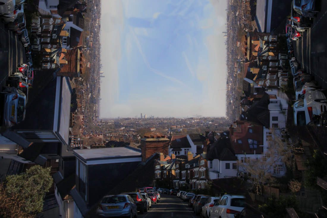
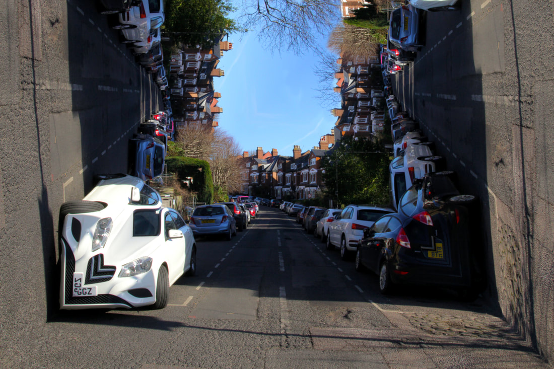
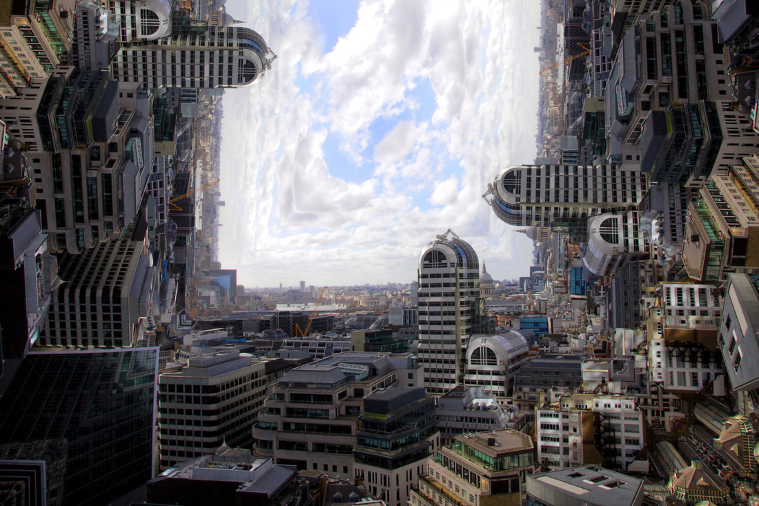
Development 3
For this development, I wanted to a larger element of the nature into these folding images. This would enhance and develop the theme of Nature vs Mankind that I wanted to portray. I was going out on a walk to Crystal Palace with my family and thought it would be a perfect opportunity to develop my photography project. The first photos are from the journey across London to get to Crystal Palace, however I didn't want to use these photographs because I wanted to photograph Central London for my final piece. Once we started walking I noticed that Crystal Palace was very hilly which gave me beautiful views. I tried to fit small elements of nature into these landscapes. This meant that I could get a nice broad landscape with buildings in the background and nature in the foreground. This was perfect because the buildings merged together with the nature represented the theme of Costa and urbanisation best. The whole idea of urbanisation and its costly consequences upon the environment was the message I wanted to portray to the viewer. As my penultimate development for this project I tried to push this message utilising the styles of Costa and Ulatan to get the best idea of how to make my final piece as best as it could possibly be. I think that I did this very well as I now have a very clear idea of how to illustrate my final piece for this 'Fragments' project.
My Response
Unedited
Edited


Annotation
The subjects I chose to photograph suited the theme because it encompassed nature and mankind together while further developing upon Ulatan's Folding Images project. I think that this development went very well because I chose a good location, Crystal Palace, to portray my theme. If this could development could be any better I would make sure that I didn't underexpose my photos so much because I think that it ruined the quality of my edited photos.
Development 4
For this development, I had a clear idea of my message to represent Nature vs Mankind, and urbanisation along with its costly consequences. For this piece, I was waiting for the best lighting conditions to take my photographs because my previous photos were too underexposed. This was because I had to compensate for bad lighting conditions. Due to the fact that this was my final piece I didn't want to have to do this because it reduced the quality and resolution of my photos. I knew that I wanted to take photos of famous London landscapes to represent their urbanisation and gentrification. However, I knew that I had to combine this with nature landcapes as well to fully take advantage of the Nature vs Mankind theme.
My Response
Unedited
Edited
Annotation
The subjects that I chose suited the theme because it had the wide landscape of buildings mixed with nature. However, I received some feedback on the edited photograph and it was said that the picture felt too crowded and domestic. So much so that it subtracted from creating a nice effect. So to improve this development I was told to go into Central London to try and get more of a focus on the buildings without the congestion of the traffic lights and dead winter trees. So to conclude, I think that this development went well in terms of understanding what to refine to achieve the best looking outcome for my final piece for this Fragments project.
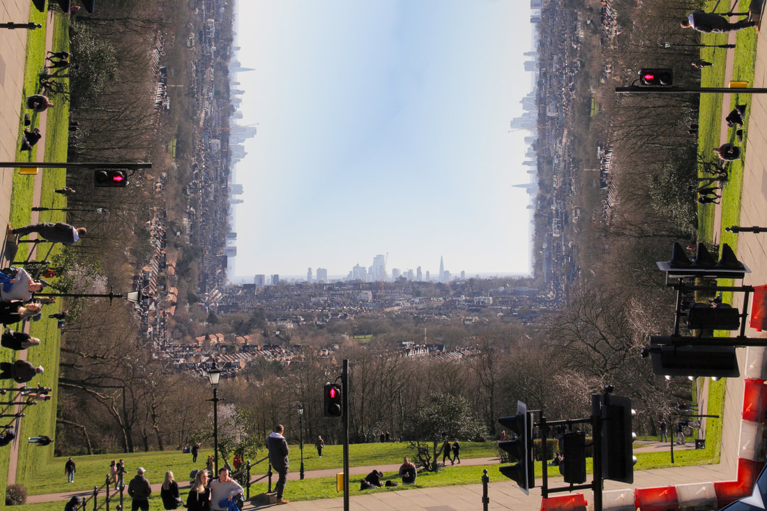
Final Development
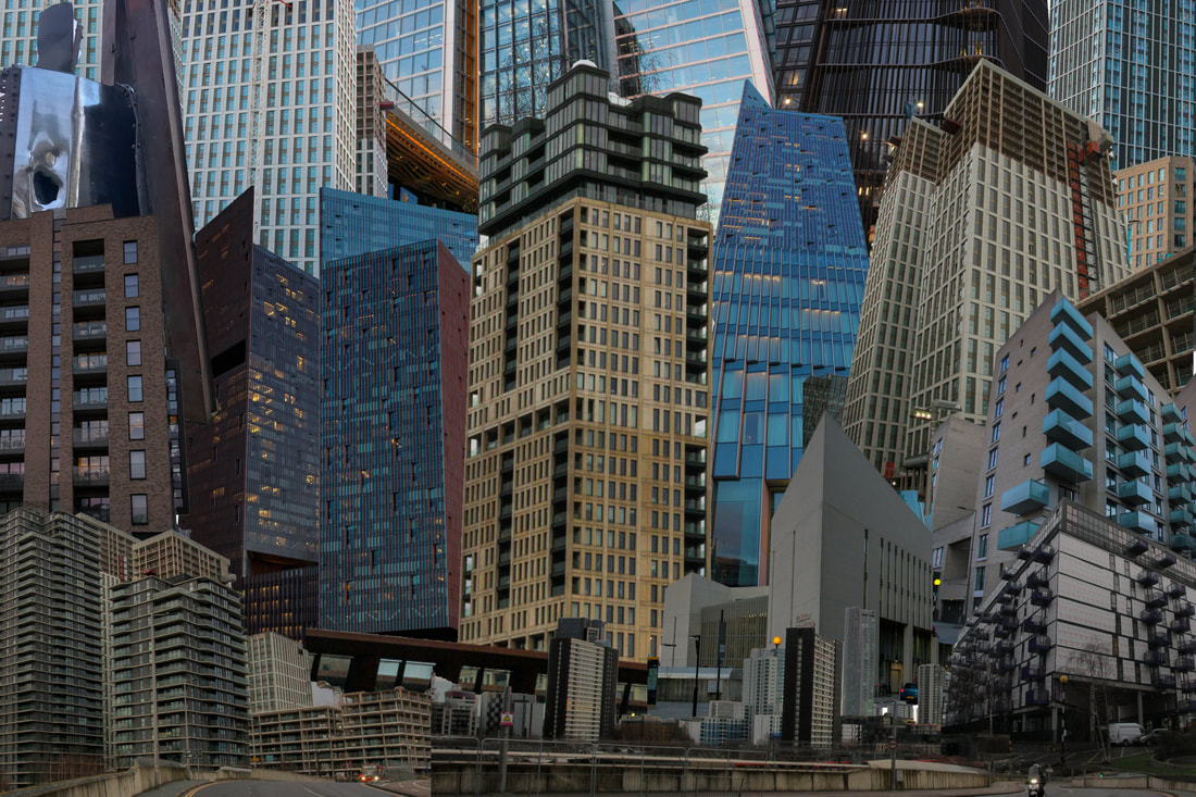
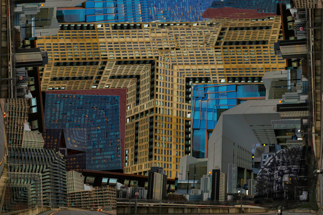
For this final piece I wanted to go into Central London to get a full Inception feel. This involved capturing lots of buildings that addressed the brief of Costa's college of the buildings with Ulatan's folding images. I wanted to stray away from the Nature vs Mankind theme because I felt it was distracted me from the actual theme of merging the two ideas behind Costa and Ulatan. Therefore, I went into Central London and searched for a vantage point to capture the beautiful views of London. The queues for the infamous Sky Garden were too immense so I had a meander around Fenchurch Street and London Bridge, which took me to the this place called Garden at 120. It was essentially a high-rise public garden slightly smaller in height than Sky Garden. It had wide panoramic views of London combined with the lovely blue skies and weather. It was a perfect shoot for my final piece for this Fragments project.
My Response
Unedited
Edited
Annotation
The subjects that I chose suited the theme because it addressed the Costa's building college effect by having lots of high rise buildings in close proximity to each other, while also illustrating the desired Inception effect of Ulatan. For this final piece, I went to Garden at 120 which was a free rooftop public garden perfect for capturing the urban London landscape. I then took this landscape and fragmented it by creating the Inception effect to address Ulatan's idea of folding images of architecture. This blend of the undertones of Costa's awareness of urbanisation with Ulatan's overarching interest of bending landscapes provided me with the best final outcome of this Fragments project. I think that I did this final piece well because I found a perfect blend of the two photographers in a way that took the best parts of each and fused them to produce a final piece worthy of the my photographic development. I used a higher ISO in this final piece to bring out the highlights better, while also solving the problem of my poorly executed underexposure attempts that I made earlier in the project. I also used a balanced composition to align the skyline in the middle of the two central thirds. I did this because I had found through the project that this provided the best outcome for the folding effect. It produced a nice cube effect of the sky in the upper central part of the photograph that I really liked. Therefore, to conclude I think that this final piece was extremely sucessful in the combination of my two photographers, however, if I had to improve it I would experiment with potential other urban landscapes that could speak to different levels of poverty and urban affordability of housing.
